Identity for a design studio working in game art and UI/UX — a mark cut from intersecting circles, a two-typeface system, and a brand built to hold up in neon, in print and at icon size.
A studio that makes game worlds needed a mark that looked like it came from one.
TenshinVisions moves between dynamic game art and interface design. The brief was a mark sharp enough to sit on a gaming peripheral and calm enough to run a client deck — one shape that works glowing on black, flat in print, and legible as a favicon.
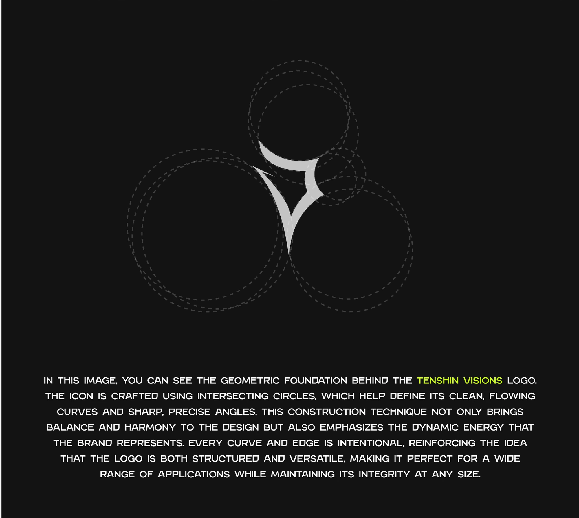
Four intersecting circles, two curves, one edge that cuts.
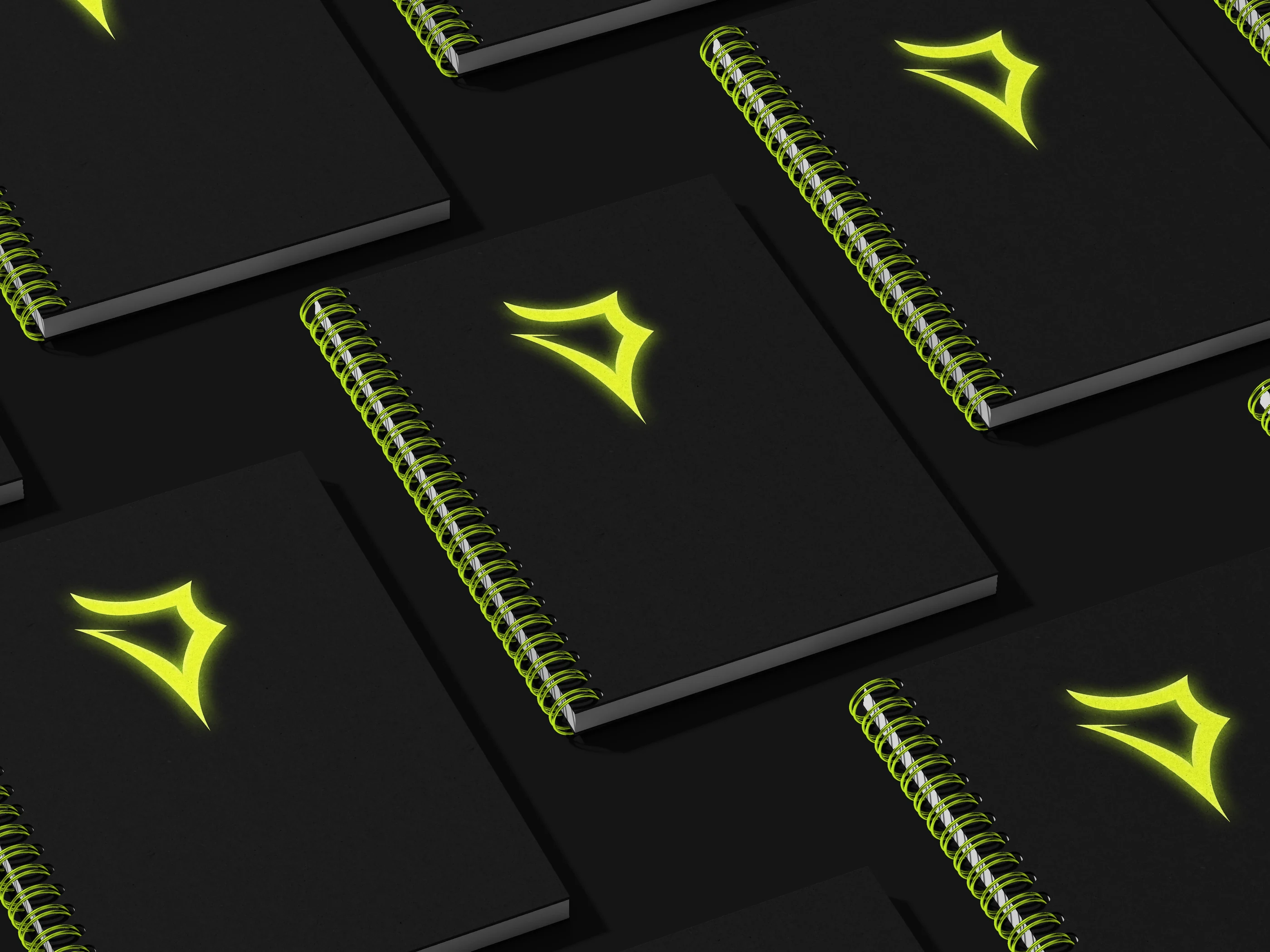
The icon is constructed from overlapping circles, which is why every curve resolves cleanly into the next. The tension comes from breaking that geometry once — a single straight cut across the top right. Structured enough to redraw at any size, aggressive enough to belong in games.
Built to move.
The identity was designed assuming motion — the mark reads at speed, which is how it is actually seen: on a stream overlay, a banner, a loading screen.
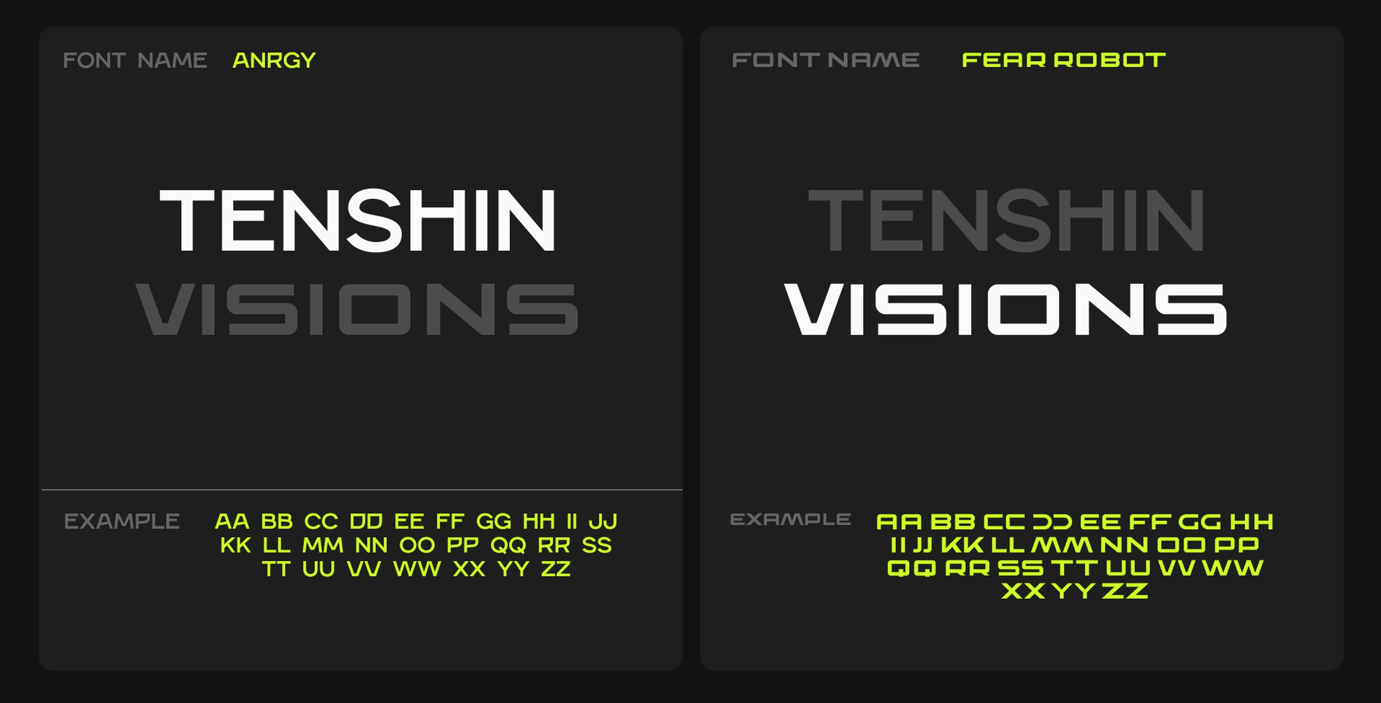
One face to shout with, one to explain with.
Angry carries the headlines — wide, blunt, built for a logotype. Fera Robot handles everything that has to be read rather than looked at. Two faces, a hard split in roles, and no third voice anywhere in the system.
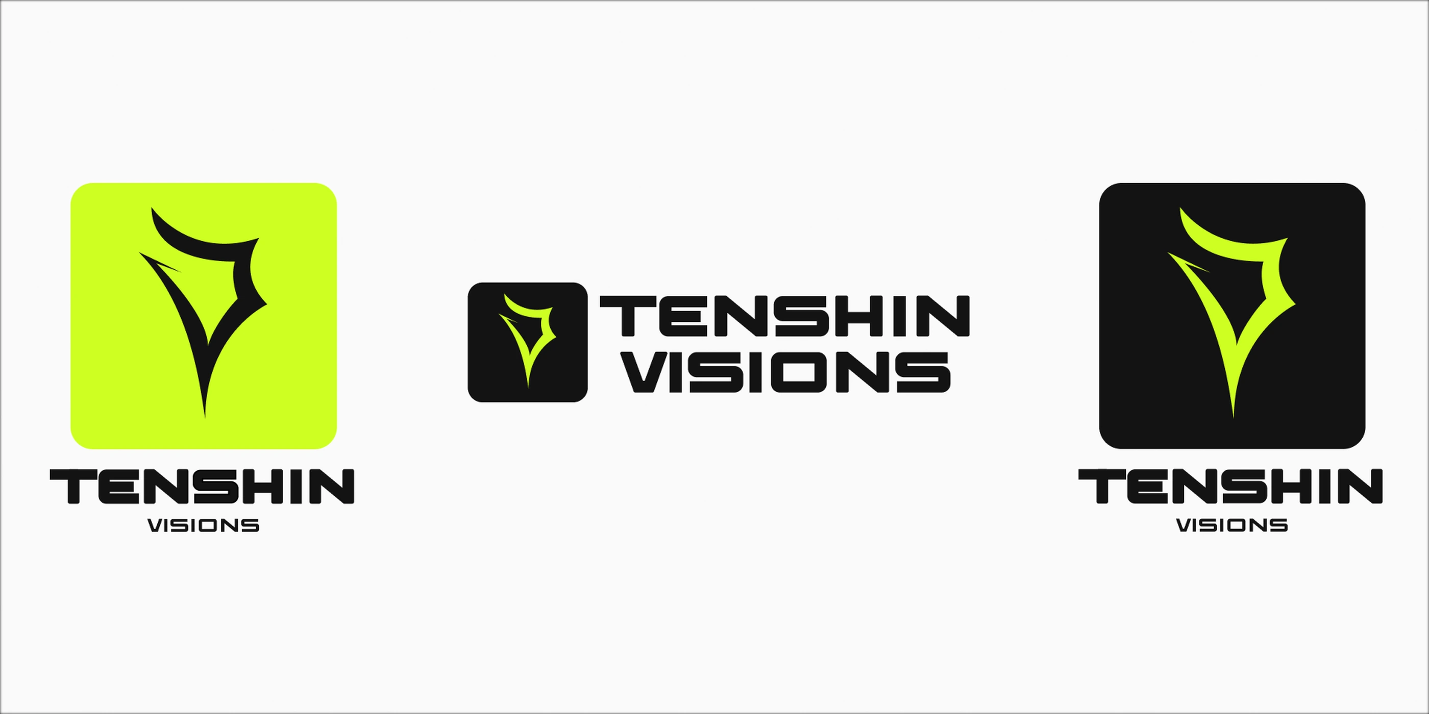
The same shape at every scale.
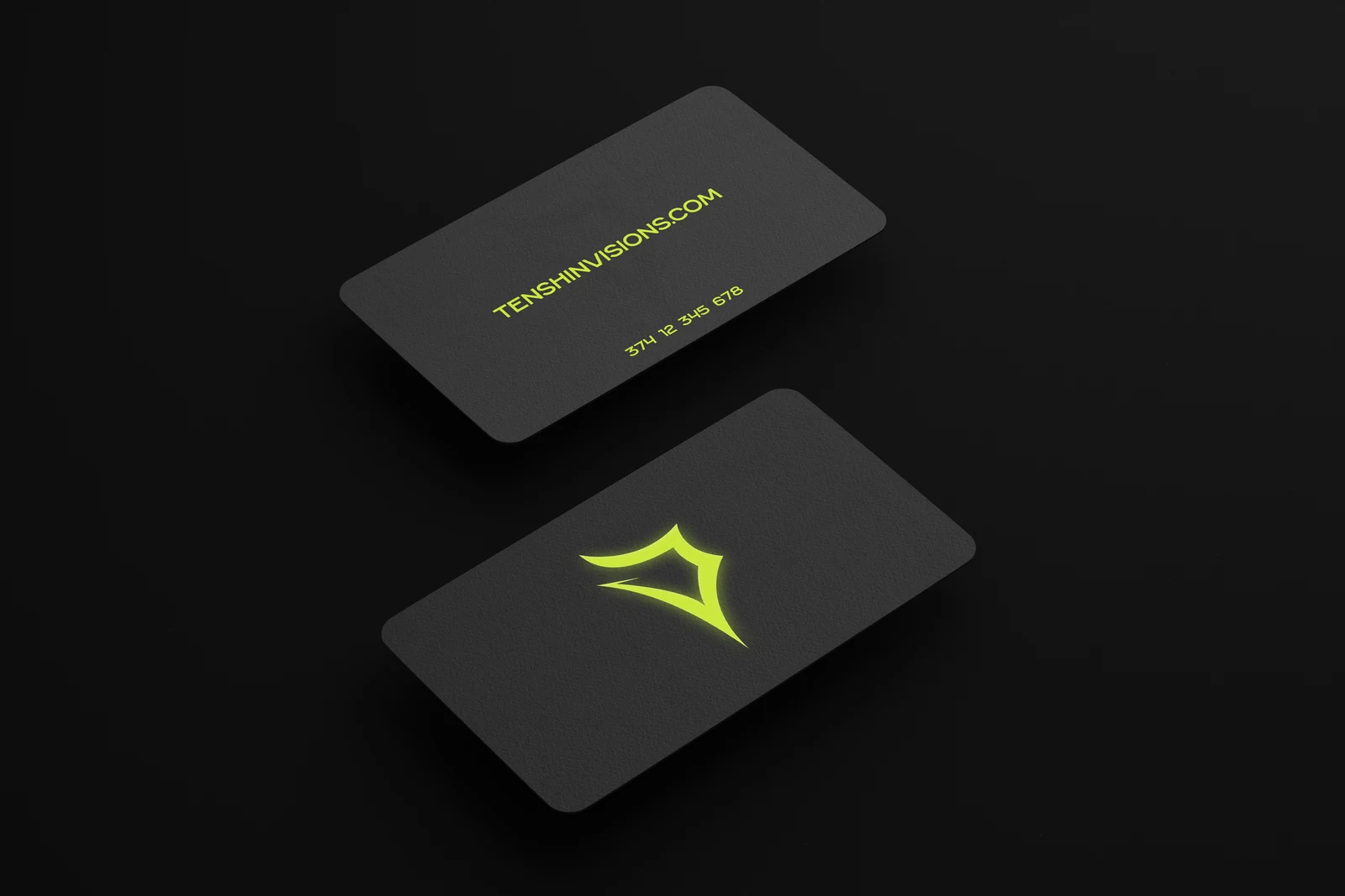
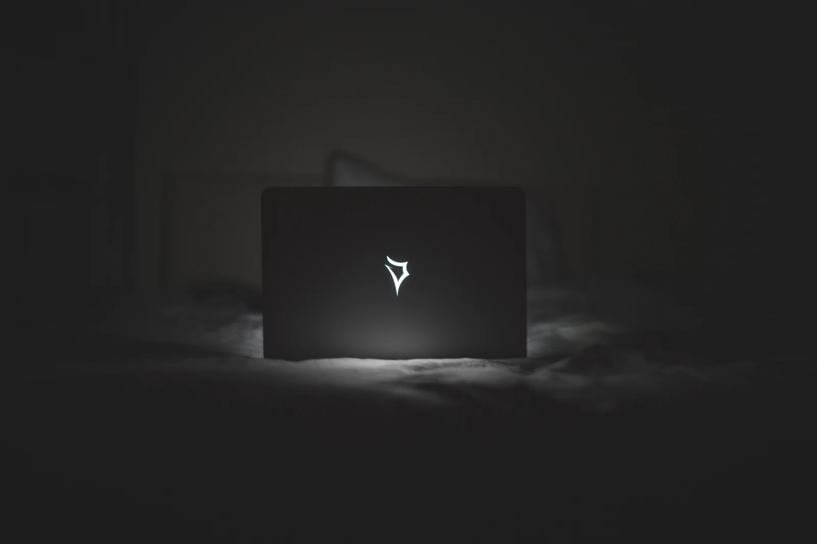
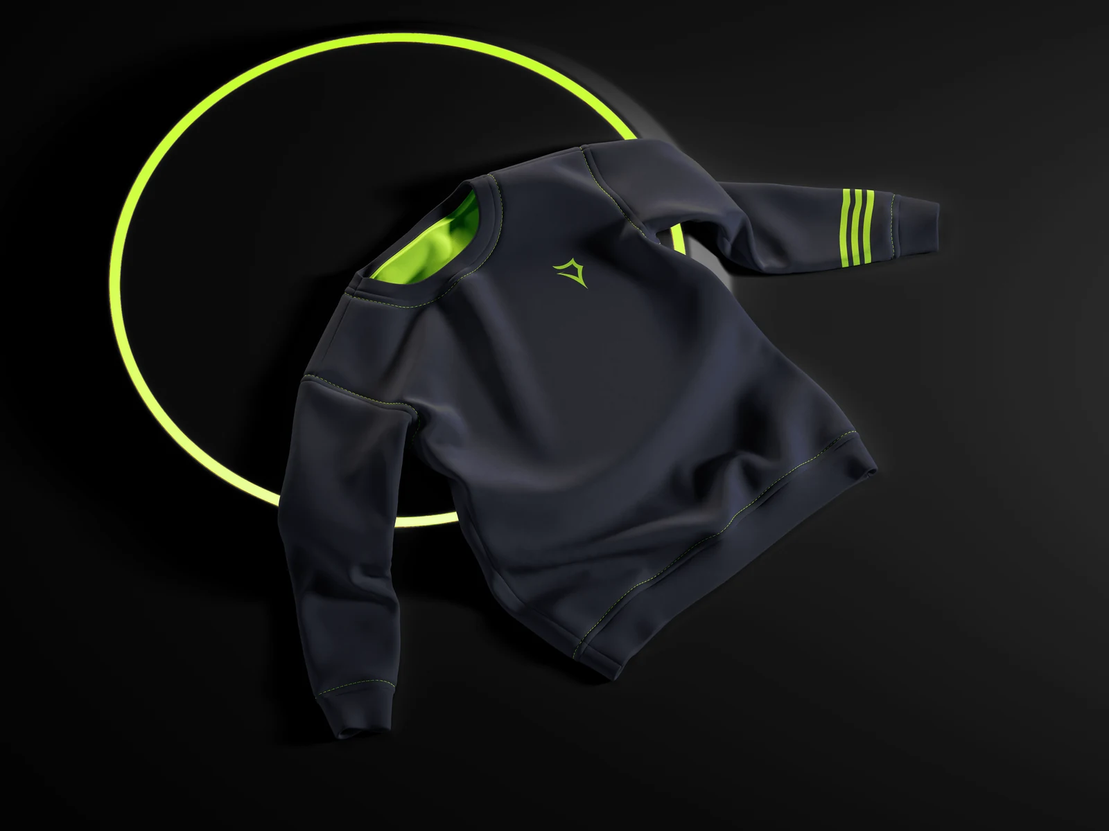
Etched into a laptop lid, foiled on a business card, embroidered on a sleeve, lit up on a billboard. Each one was a test of whether the mark survives the material — and the cut edge is what makes it survive.