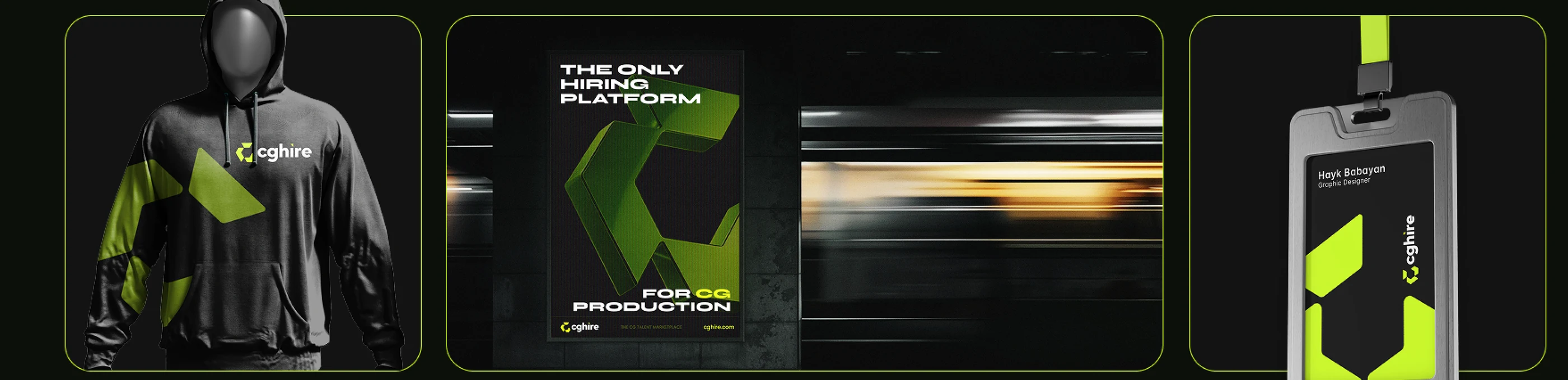
Identity and motion for CGHire — a freelance marketplace built only for game, VFX and 3D production, in an industry where portfolio fraud is the default risk. Mark, type system, app icons, product UI and a 42-second brand film.
Every CG studio has hired someone whose reel was not theirs.
CGHire is a freelance marketplace built for one industry: game development, CGI, VFX and 3D production. Generic platforms rank people by keywords and star ratings, which is exactly how stolen reels and borrowed credentials get hired. The brief was an identity that reads as verified before anyone has read a word — and a system that works from a favicon to a 42-second film.
 Video · autoplay
 Video · autoplay
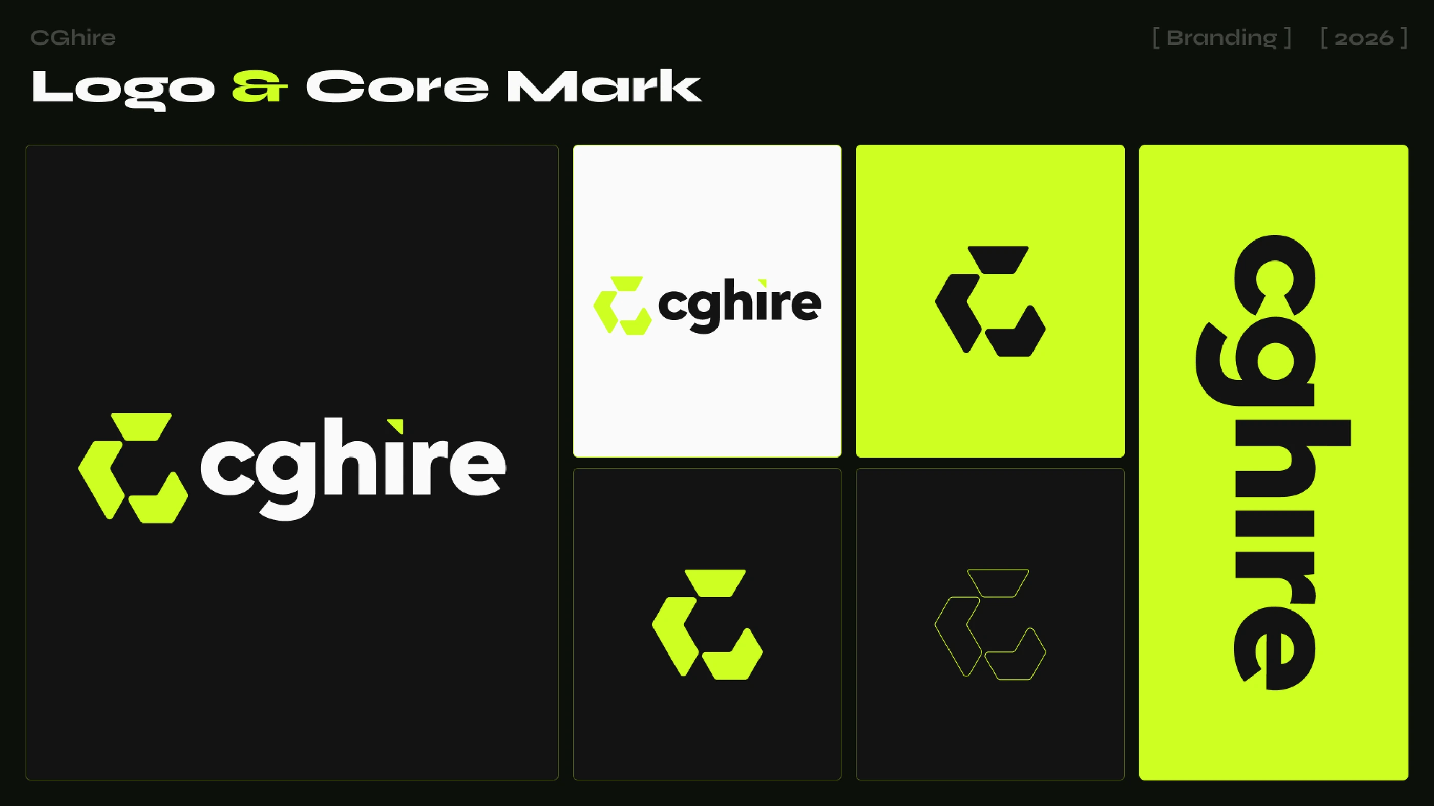
A C built from three chevrons that never close.
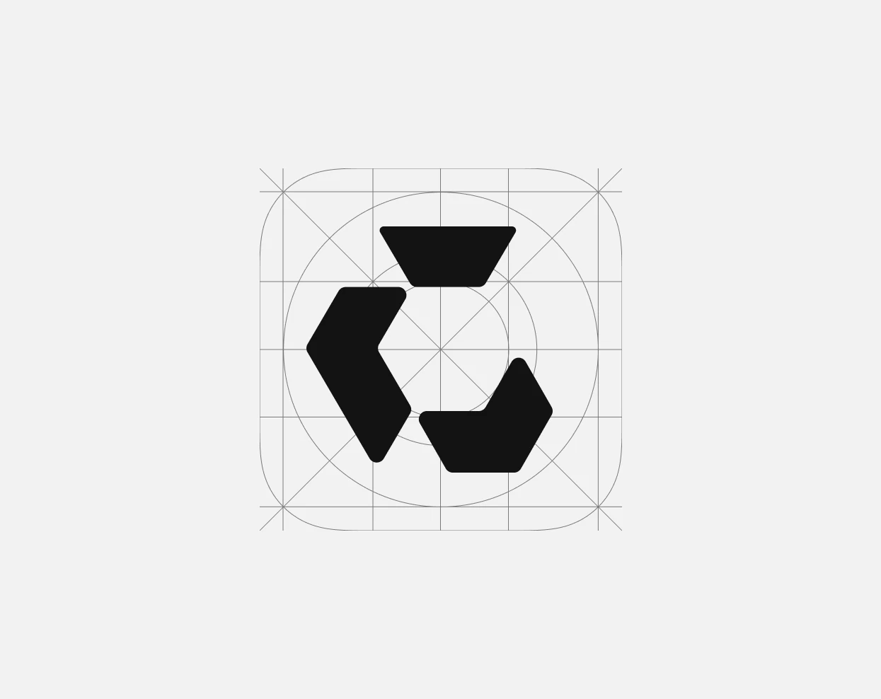
The mark reads as a C, as a loop, and as three stages handing work to each other — the way a CG pipeline actually moves. It is drawn on a hexagonal grid at a single angle so it stays sharp at 16 pixels and survives being cut out of vinyl. The gap is deliberate: the system is open at one end, because the pipeline never really finishes.
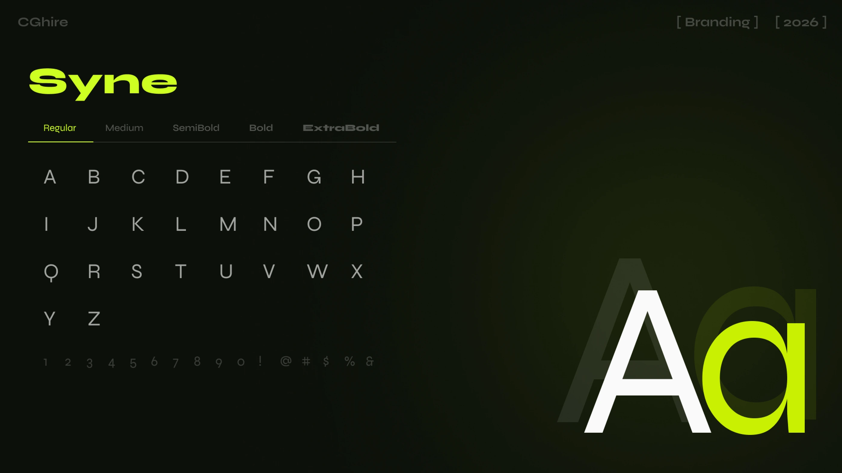
Syne, because it is engineered and slightly wrong.
Syne has the geometry of a technical face with letterforms that refuse to behave — the same tension as the industry it serves. Regular carries interface copy, ExtraBold does the shouting. One family, five weights, no decorative second typeface anywhere in the system.
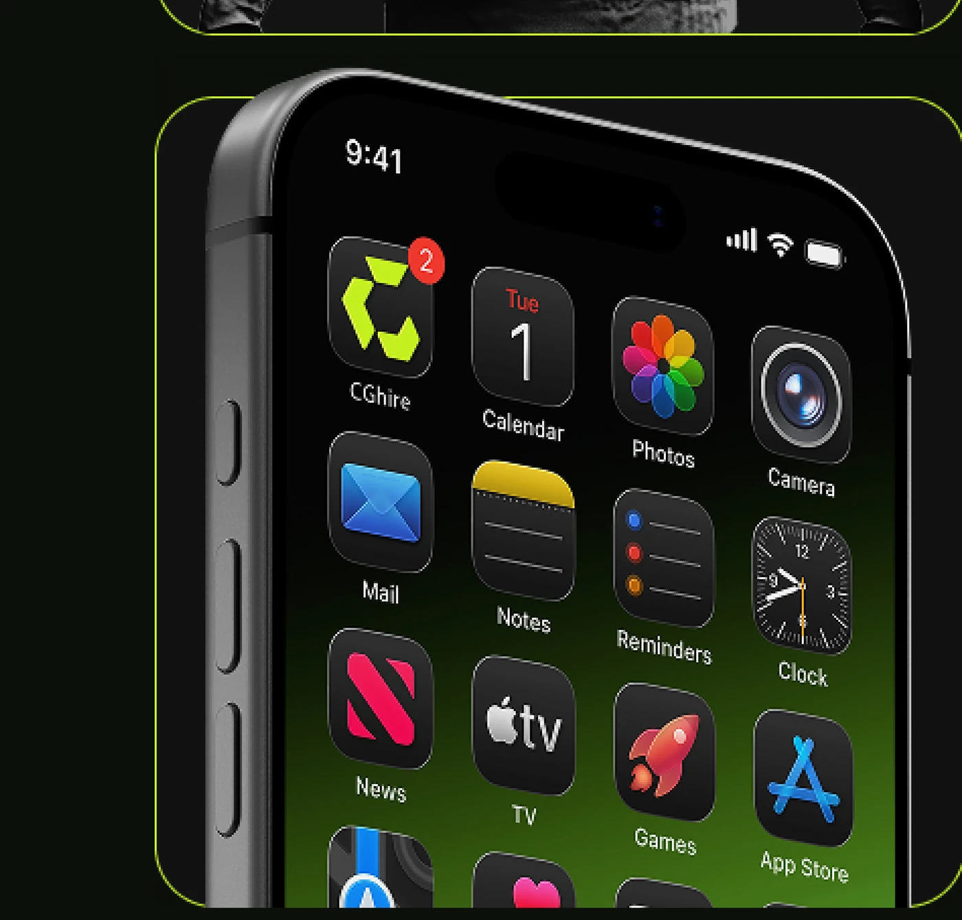
The mark had to survive the home screen.
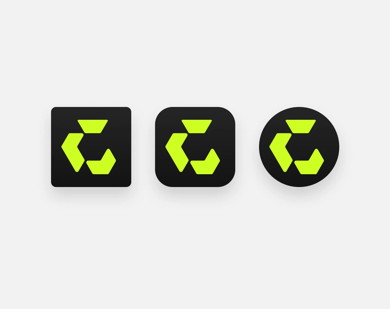
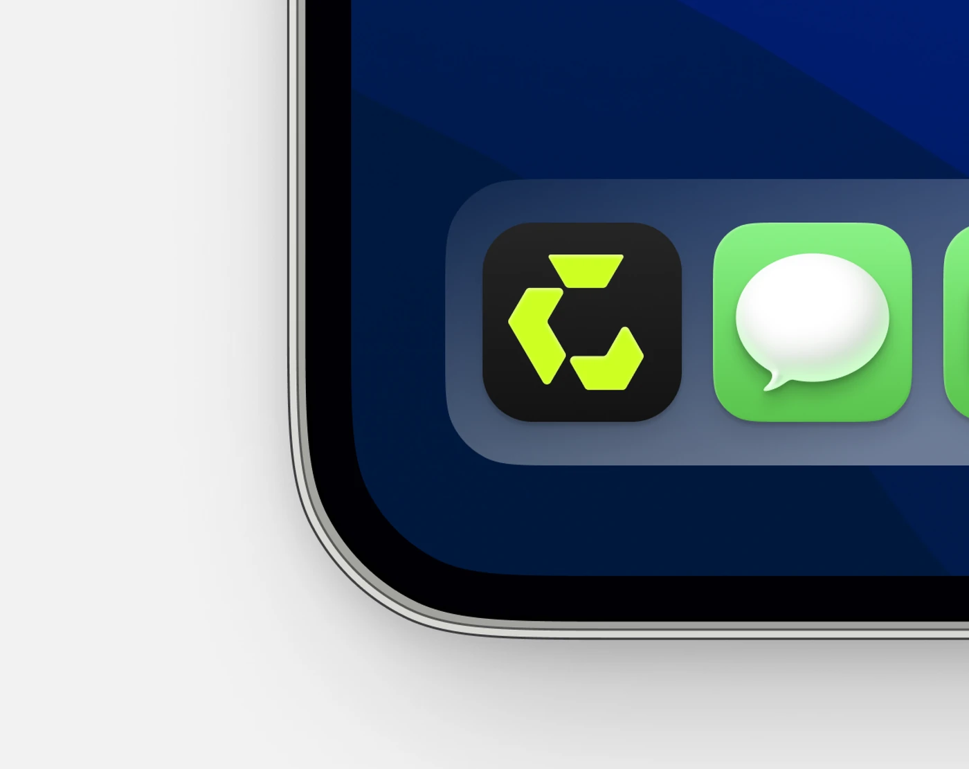
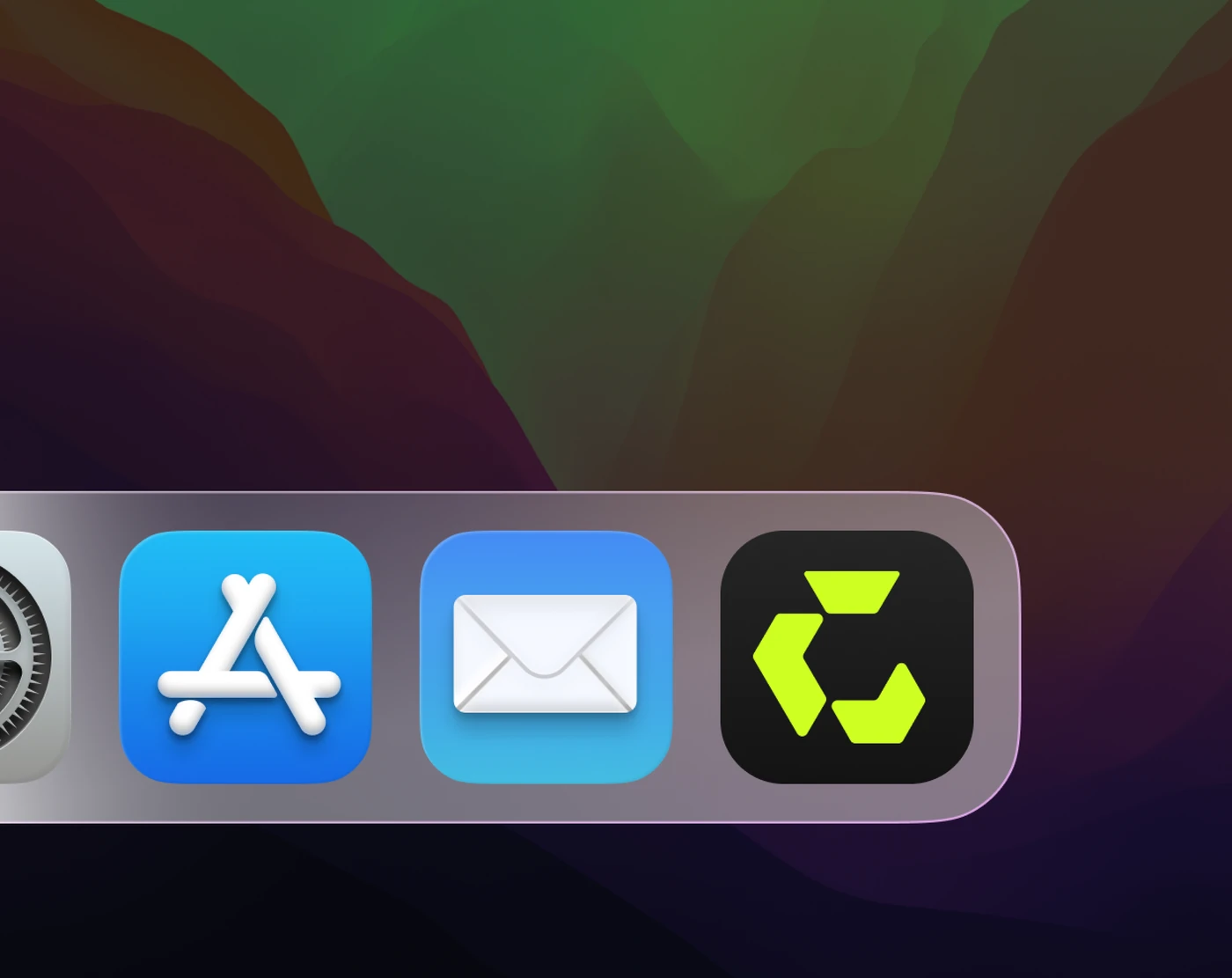
An app icon is the smallest and least forgiving place a brand ever appears, so it was drawn first, not last. The chevrons are redrawn at icon scale with their own optical weight, then tested in an iOS dock, a macOS dock and a browser tab before anything else got approved.
Pricing is a design problem before it is a business one.
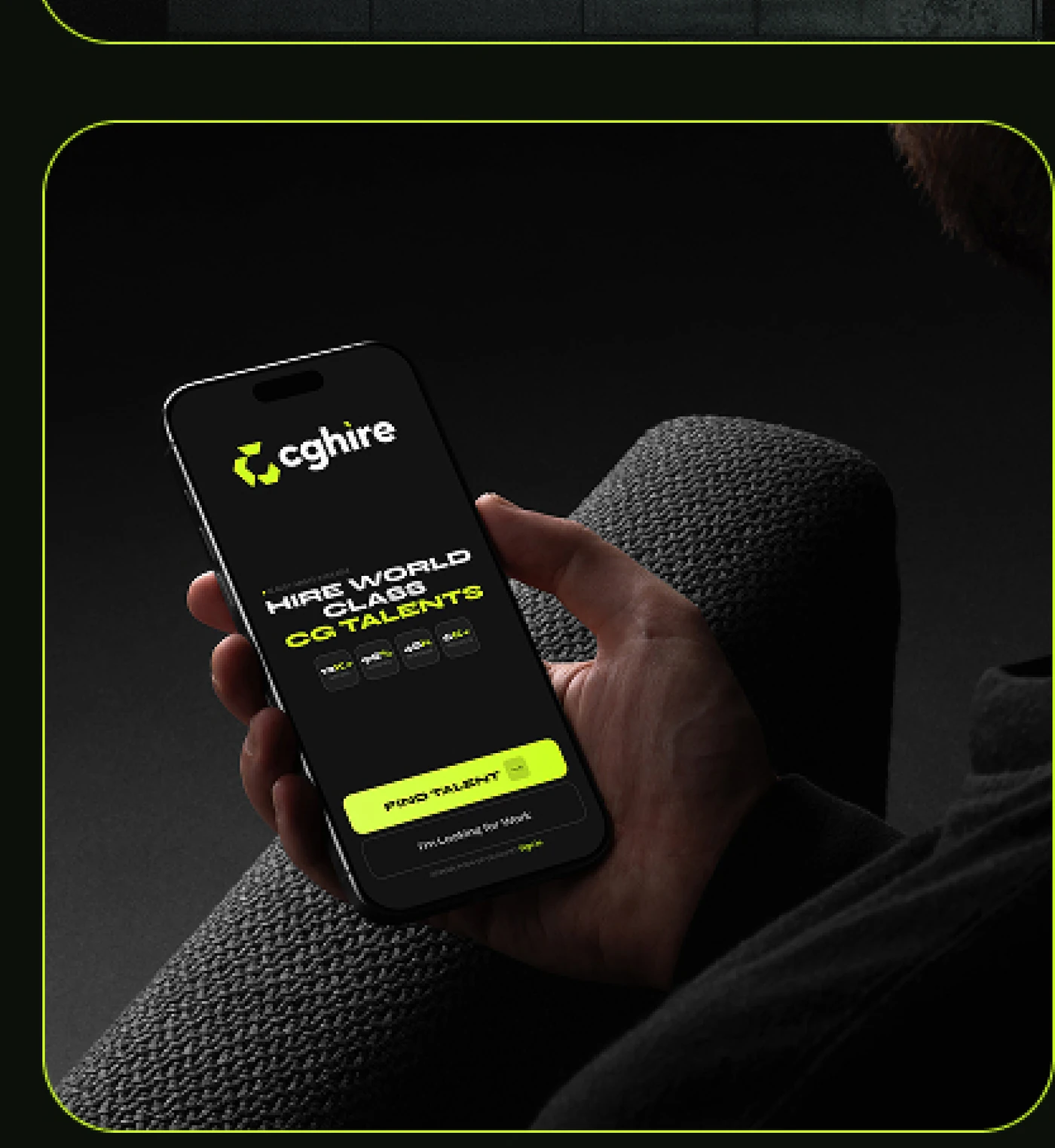
Three tiers — free, nineteen, thirty-nine — laid out so the middle one wins without a "most popular" badge doing the work. Acid green is rationed to one job per screen: the thing you are meant to press.
 Video · autoplay