Full brand identity for an agri-tech startup raising its first round — logo, colour system, typography, investor deck and 30+ assets over 18 months.
What does a two-person startup look like when it has to convince a room of investors?
AgroLink connects farmers with buyers and logistics. When we started there was a pitch, a prototype and no visual language. My job was to give the company a face that reads as established without lying about its size.
Research
Twelve competitor identities, three farmer interviews, one very honest founder.
Identity
Mark, wordmark, colour and type built for a slide deck first, a field sign second.
Rollout
30+ assets over 18 months while the product changed under us.
Agri-tech brands either look like tractors or like crypto.
The category defaults to either rustic green leaves or cold gradients. Neither builds trust with a bank, and neither survives being printed on a warehouse banner at 3 a.m. We needed a third option.
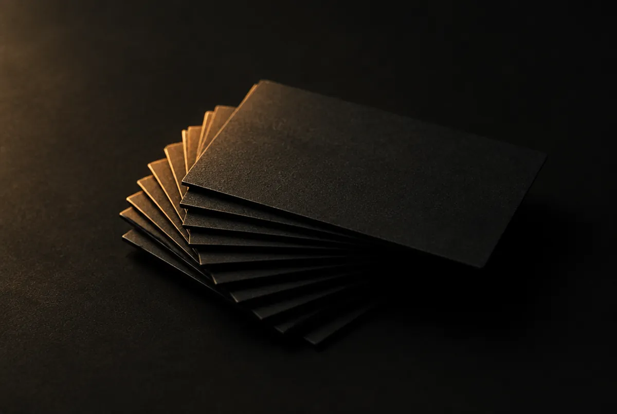
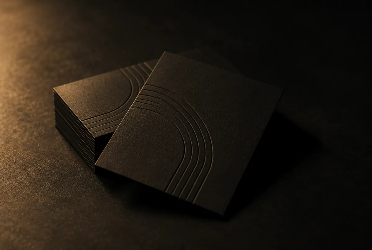
One mark, one wordmark, three lockups — built to survive a bad print job.
The mark is a seed drawn with a single stroke weight so it holds at favicon size and on a 6-metre banner. Colour is a single deep green with a warm off-white; type is one grotesk with a serif reserved for numbers in the deck.
 GIF · loop
Investor-ready in the sense that investors actually read it.
Twenty-two slides, one idea per slide, numbers set in serif so they feel considered. The deck supported the company’s first funding conversations.

Eighteen months, one identity, zero redesigns.
The system held through three product pivots. Every asset since — social, web, print — was built from the same kit, by me and later by the team without me.