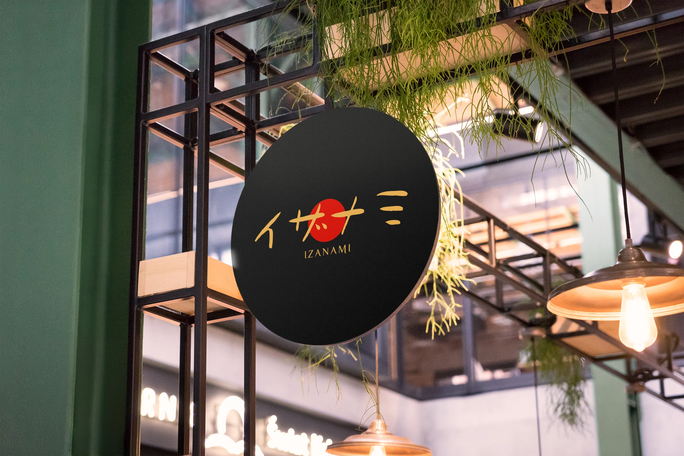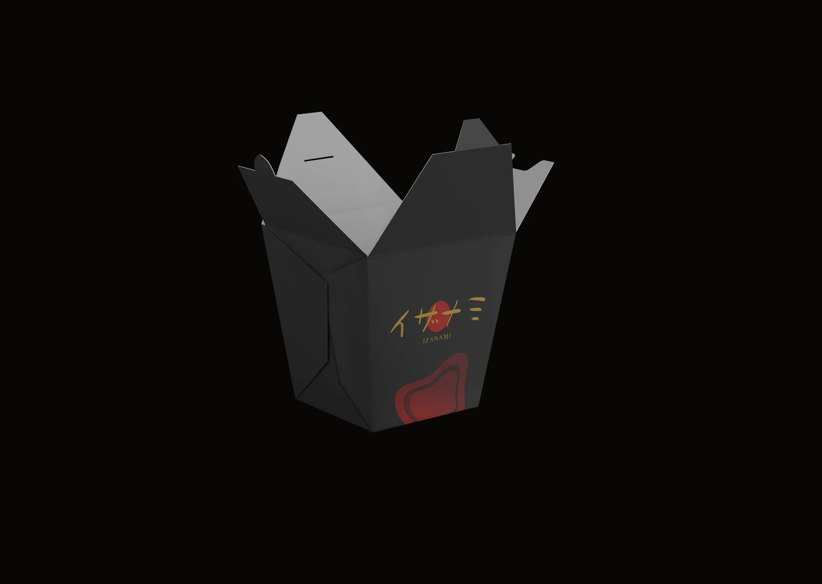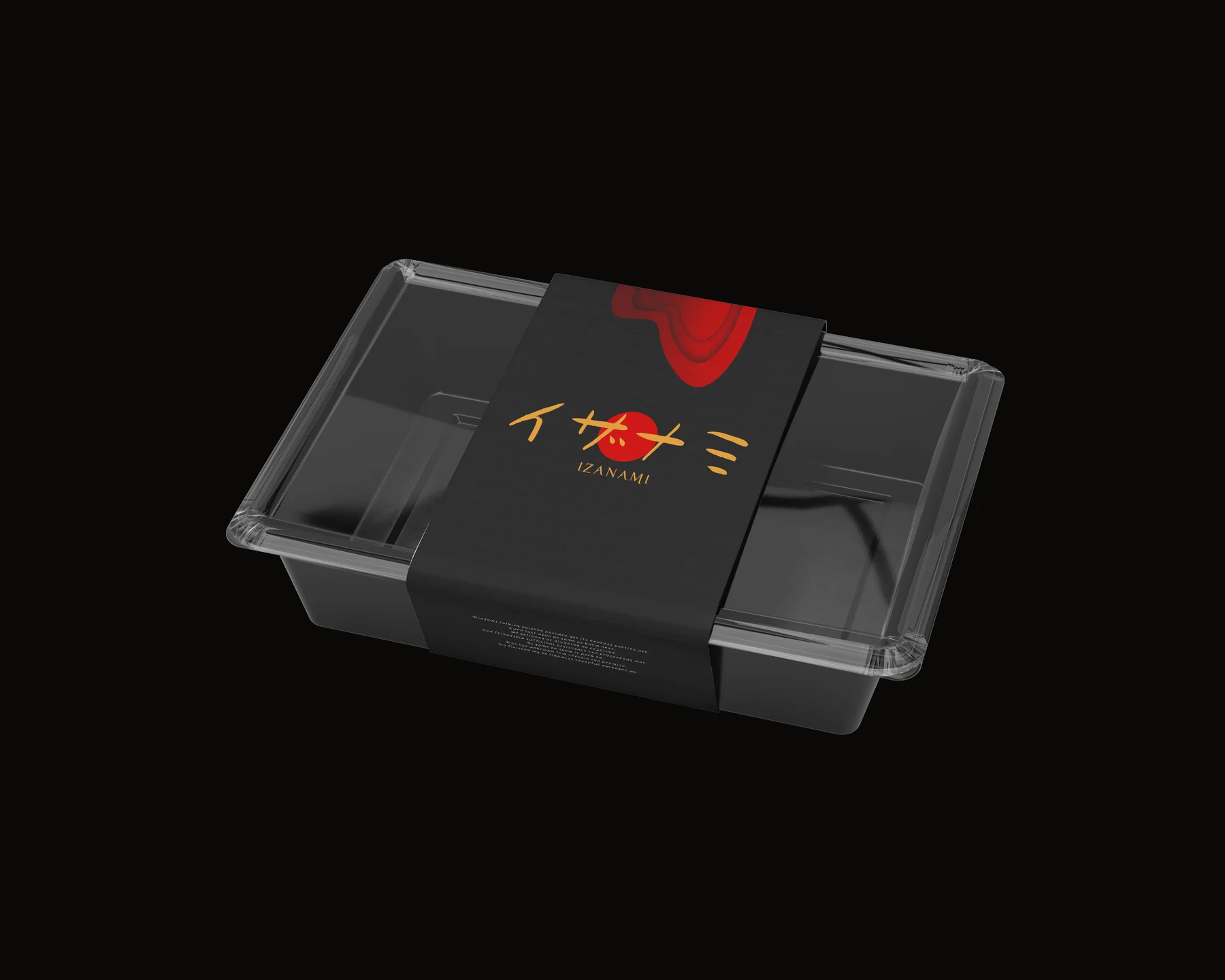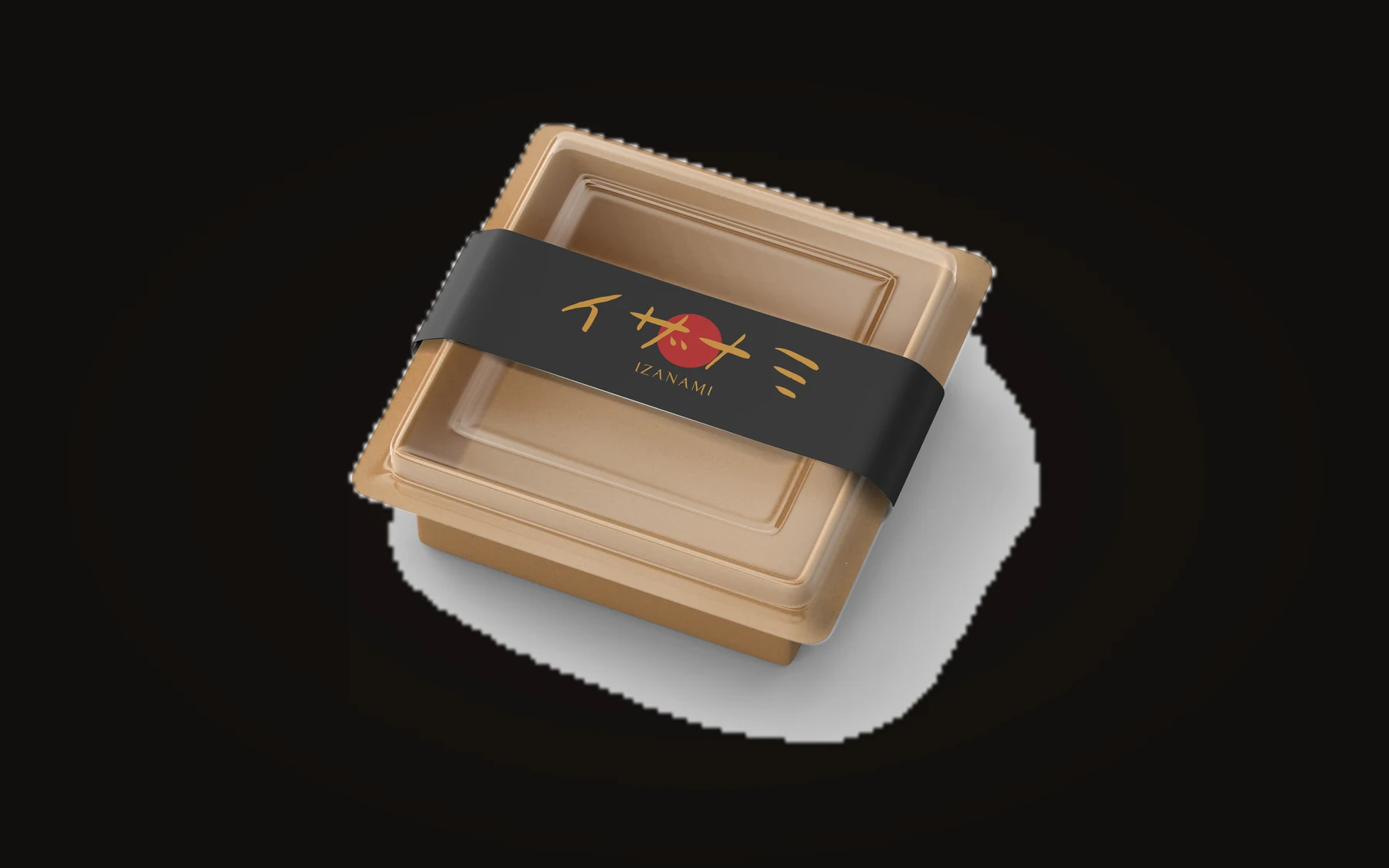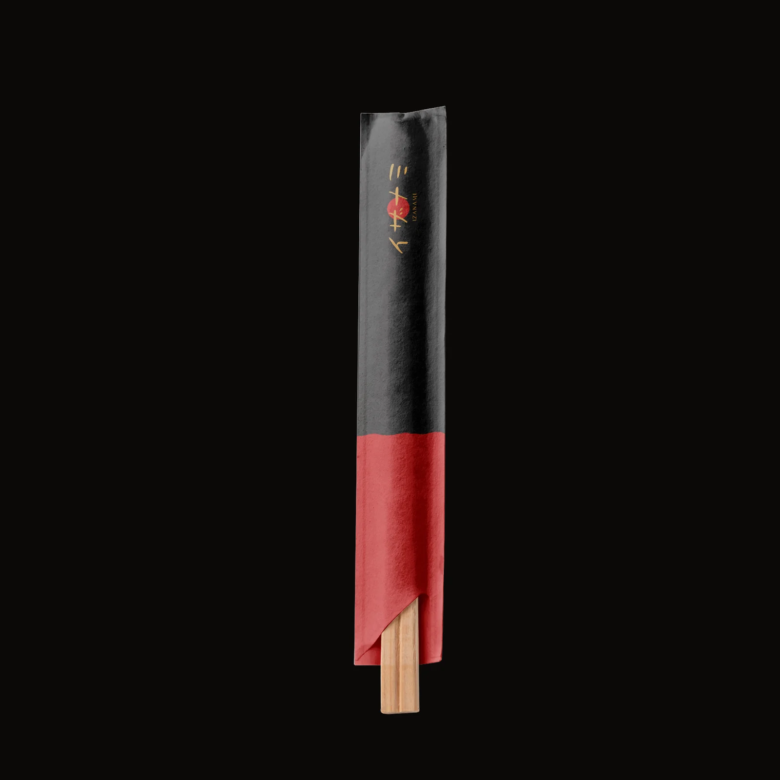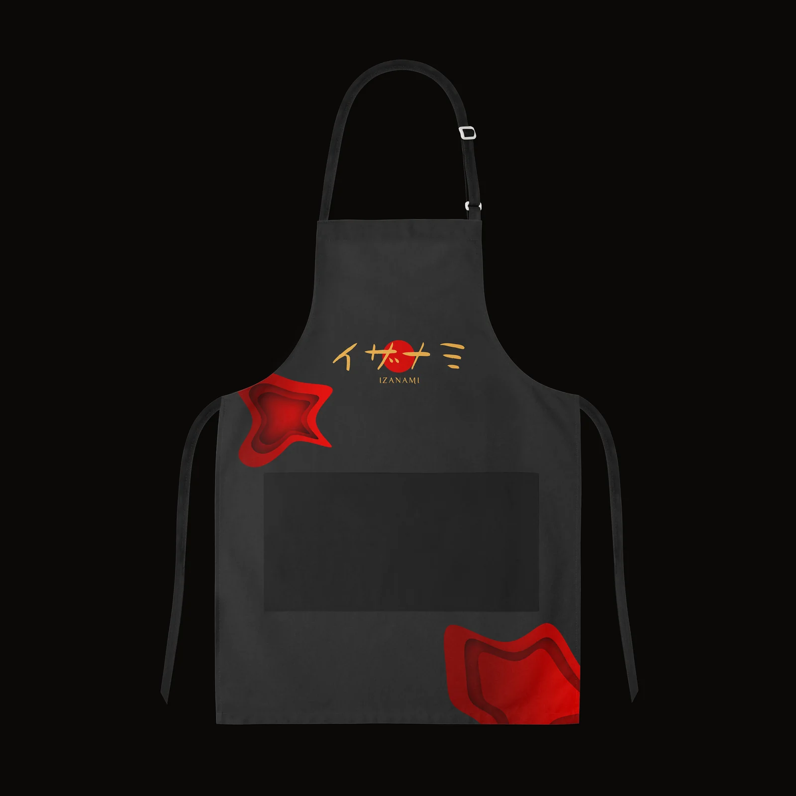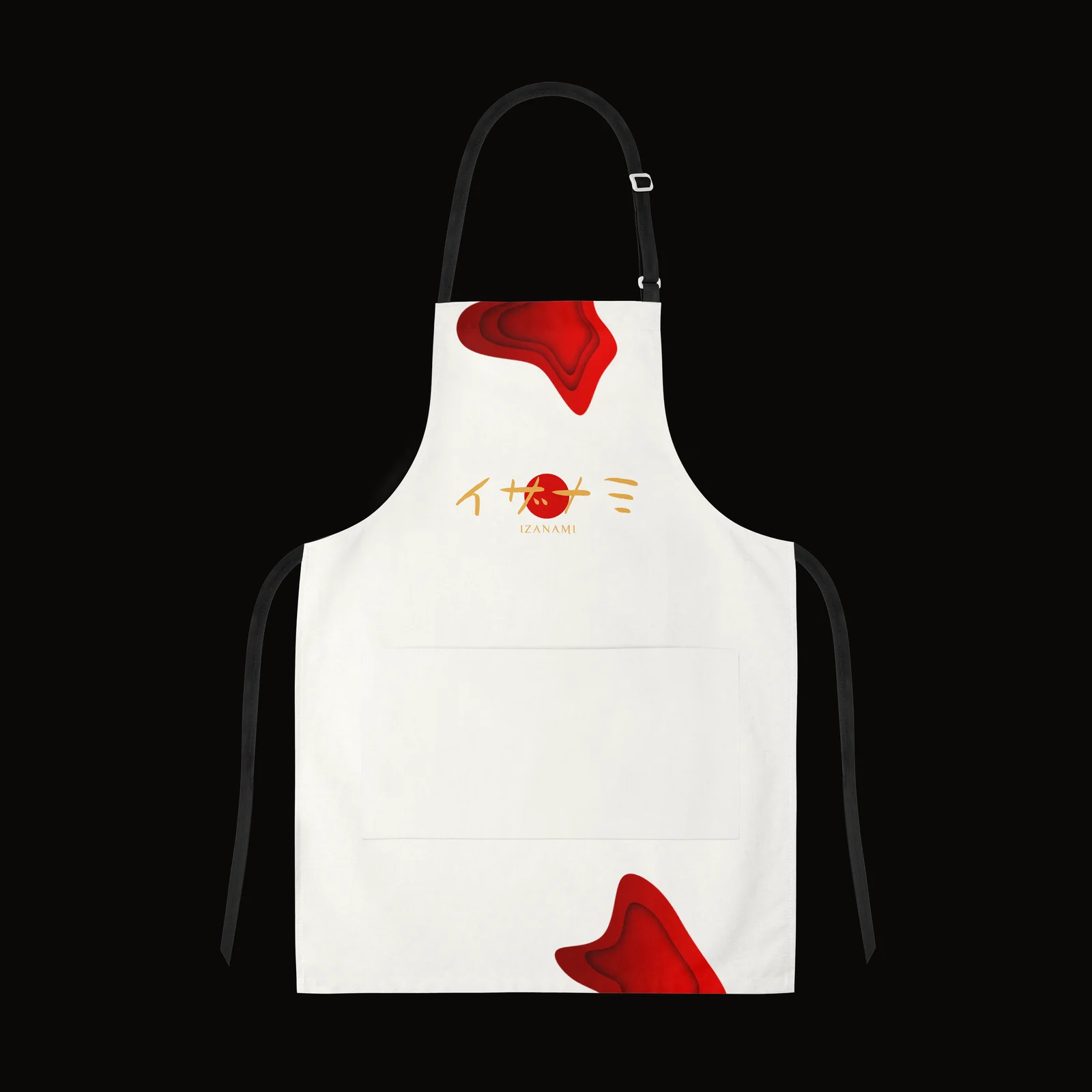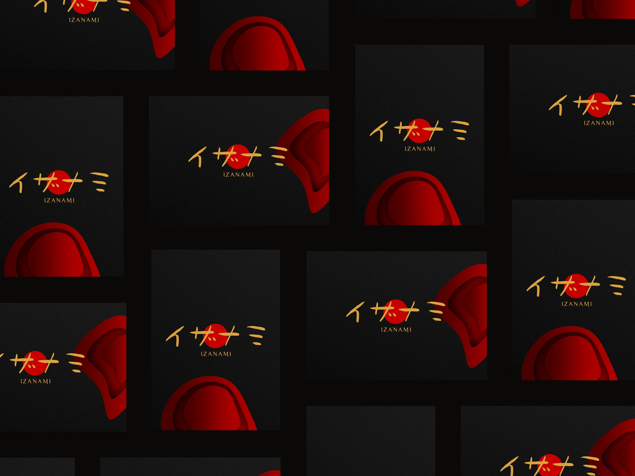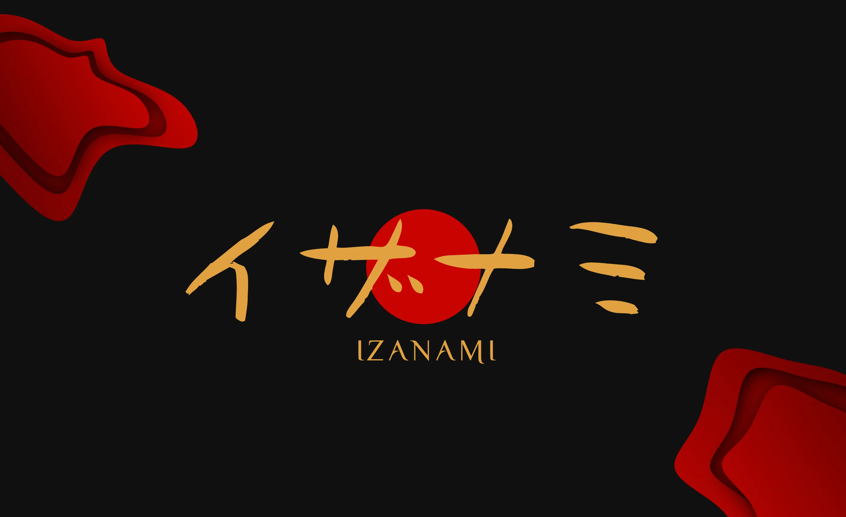
Identity for a luxury Japanese restaurant named after the creation goddess. A katakana wordmark built around a red rising sun, a system of hand-cut paper waves, and gold on black carried across menu, packaging and signage.
A restaurant named after a goddess should not look like a takeaway.
Izanami is the Japanese goddess of both creation and death — a name that asks for weight. The identity had to read as a fine-dining room from the street sign down to the chopstick sleeve: restrained, warm, unmistakably Japanese, and expensive without shouting it. Three colours, one wordmark, and a single recurring motif do all the work.
Four katakana and a rising sun.
The name is set in katakana — イザナミ — with the dot of the second character replaced by a red sun, the one unmissable mark on an otherwise black field. The strokes are drawn by hand, not typed, so the wordmark has the irregular weight of a brush rather than a font. A small Latin “Izanami” sits beneath for the people who can’t read it.
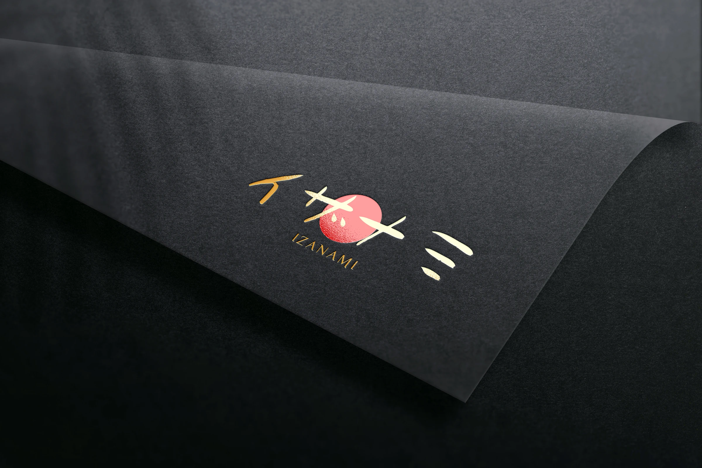
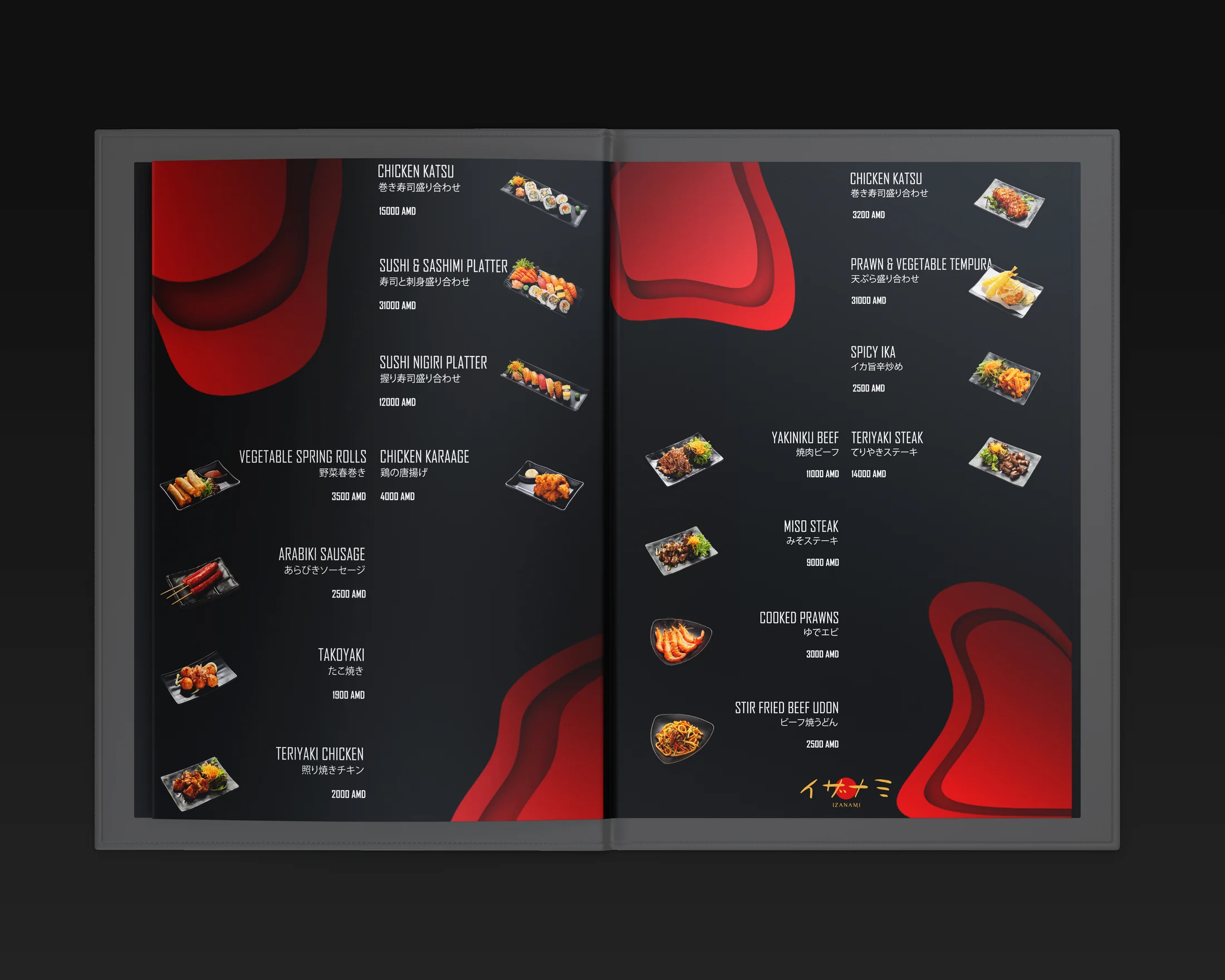
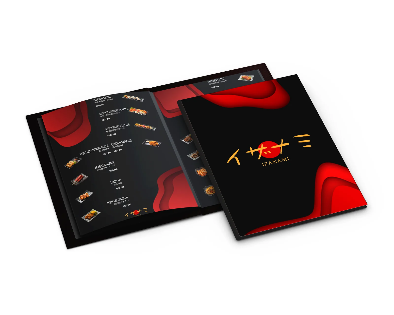
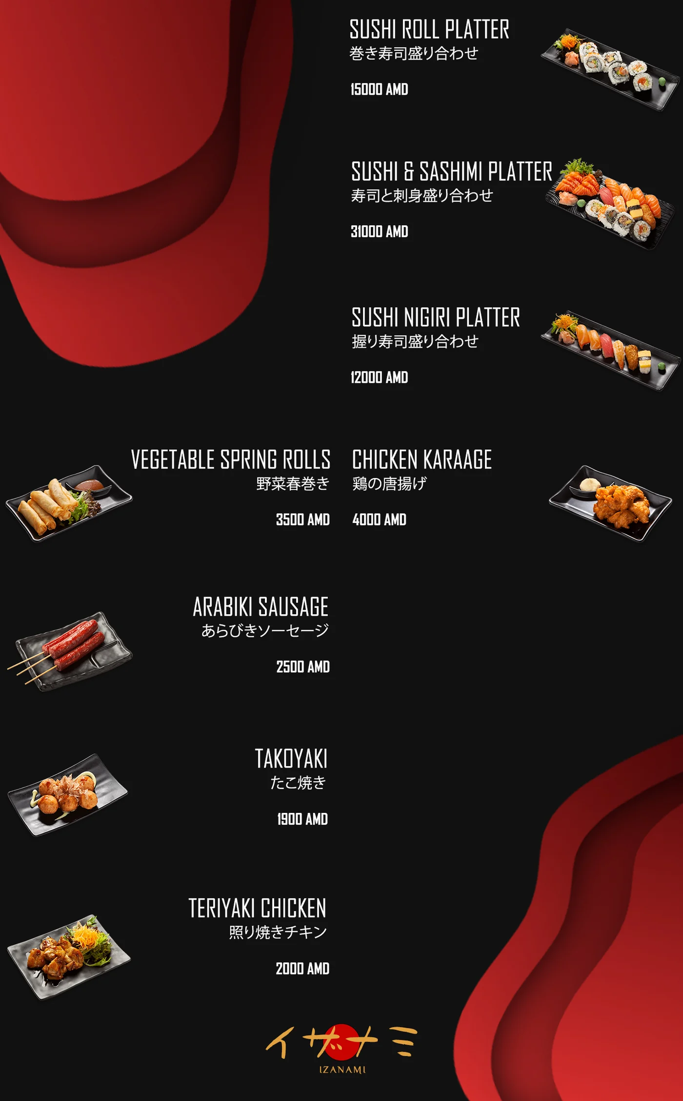
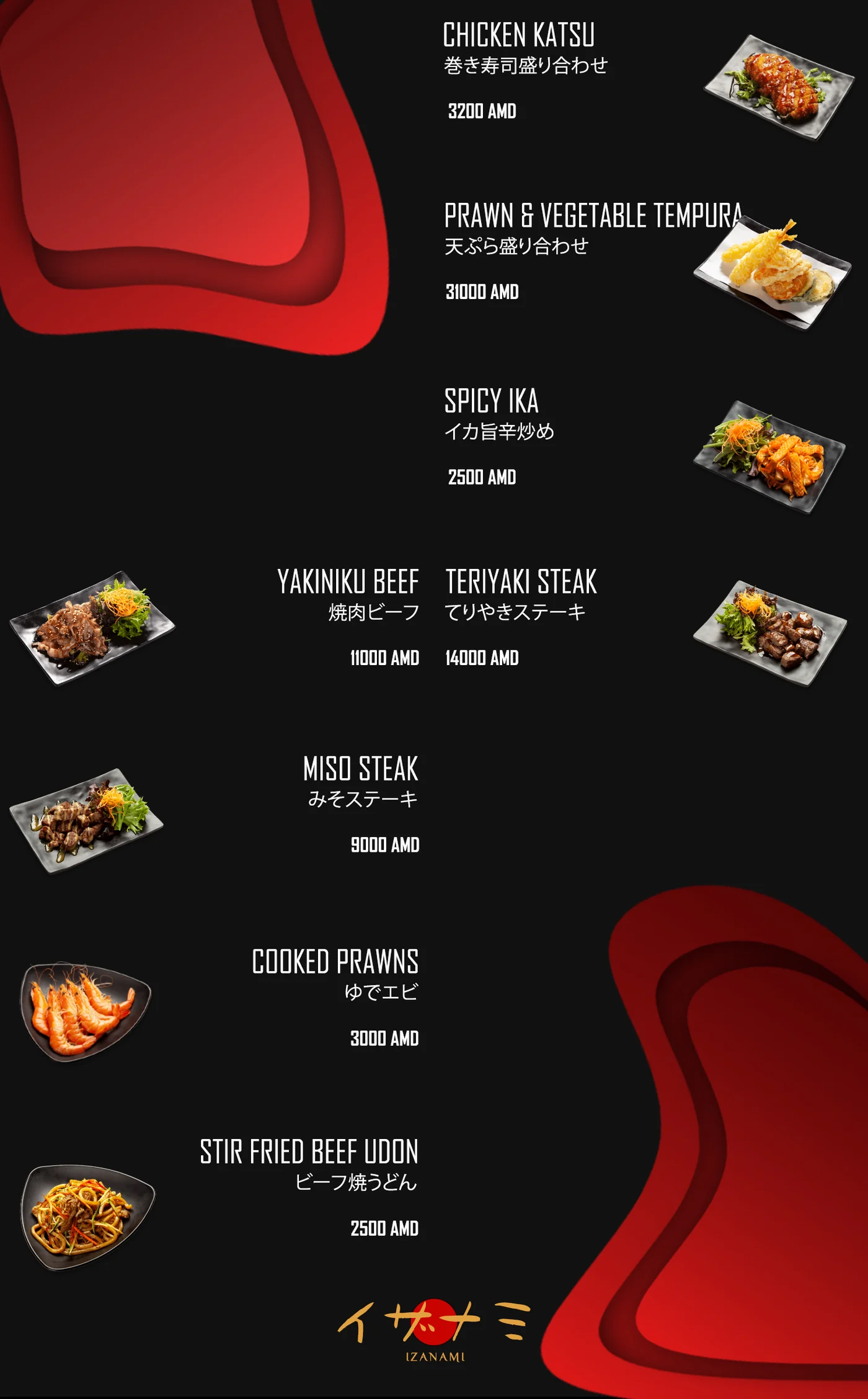
Street sign to chopstick sleeve.
The same three colours carry everything: the disc hung over the door, the sign on the building, the boxes and trays the food leaves in, the apron on the pass, the card that leaves with the bill. The red sun is the constant — shrink everything else and it is still the thing you recognise.